Essential Attributes Describing Good Landing Page Experience
A landing page can be defined as a page to which the traffic is diverted through any type of marketing activity. In the case of e-commerce, traffic is acquired to convert it into a business. Your campaign goal could be anything from brand awareness, and lead generation to sales conversion; the one constant among all of them is the landing page to which a prospect is directed.
Landing Page Experience and E-Commerce Store
Like in an offline store a salesperson plays a crucial role in persuading a prospect to purchase the product.
Similarly, your website’s landing page acts as a salesperson for your online store. The more informative, self-explanatory, and welcoming the landing page, the easier it will be to engage and convert a visitor into a customer.
In the case of an e-commerce store, the aim of creating a good landing page experience is to generate sales. A landing page could be your website’s home page, catalog collection page, or product page itself, depending on your marketing goals.
Now, as an ecommerce merchant put yourself in the shoes of a buyer. Closely analyze what you would expect to see if you were diverted from shopping ads to a website’s landing page (product page in our case). Here are a few things that you could keep in mind:
Maintain a clear and consistent message between your ad and the landing page.
When a consumer is routed from an Ad to a landing page, they certainly expect the same appeal that grabbed their attention to click on the ad in the first place. This implies, your ad communication must be aligned with the website’s landing page.
We’ll use an example to understand this:
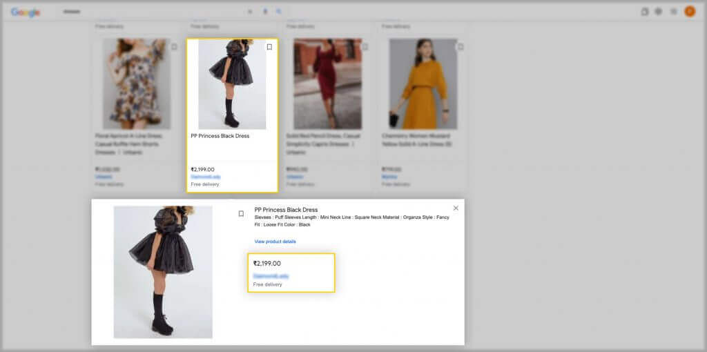
The 1st image is from Google Ads that showcases a product priced at 2199.00 with minimal product information.
Let’s closely monitor these two images below :
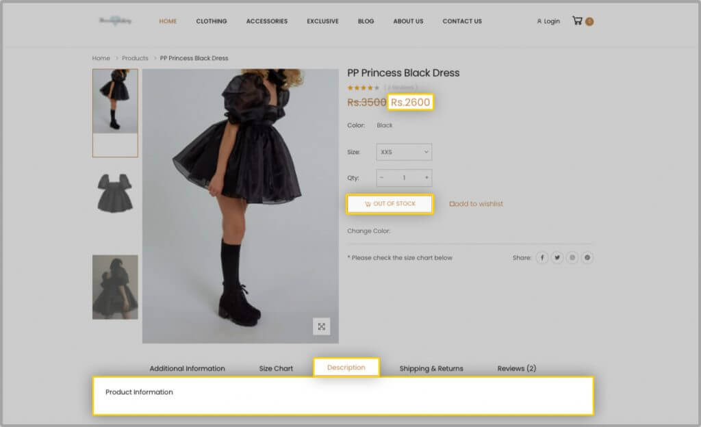
The 2nd image is from the online store where the same product is priced at 2600 and has no product description. Moreover, the product is currently out of stock.
Now let’s look at this from a shopper’s perspective.
A buyer may have loved the product image and clicked on the Ad. But, when they were taken to the website, where the product was out of stock, the price for the same product had risen from 2199.00 to 2600.00. Above all, there is no product description.
This results in the biggest turnoff for a visitor, he may feel a bit betrayed and this leaves a negative impression of your brand in their consciousness.
Key elements in your landing page’s layout
Your product ad just gives a gist of what you’re selling. Moreover, when a visitor arrives at your landing page, he or she will hunt for more precise information. Hence, make certain that your landing page delivers it to them.
It should be designed in a way that a new shopper visiting your store’s website can quickly grasp the required product information. This implies that you should create a landing page that visitors are accustomed to seeing on other stores in your niche.
A. Product visuals
For a better understanding of the product, we recommend showcasing product images from every aspect of the product (Usability and USPs), in addition to this, if possible, add a short video highlighting the product’s USPs. Videos are an interactive way of engaging customers with your webpage.
B. Product and its Variant details
If you’re running ads for a specific product variant, make sure the title is optimized and that it’s replicated on the landing page. The title says a lot about the product you’re selling on your website. It should be designed in such a way that a user can recognize all of the product’s basic elements from a single glance.
Let’s look at an example to better understand this:
A shopper is looking for a “shirt” on Google Shopping, and the results show a list of options to choose from.
There is one product that says “Women Black Dress”
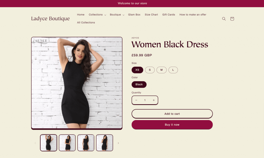
When we look at this ad, all we know about the product are:
Gender the product applies to Women
Color: Black
Product: Dress
Then there is another one that says “Adyce O-neck Runway Solid White Mini Evening Knitted Dress”
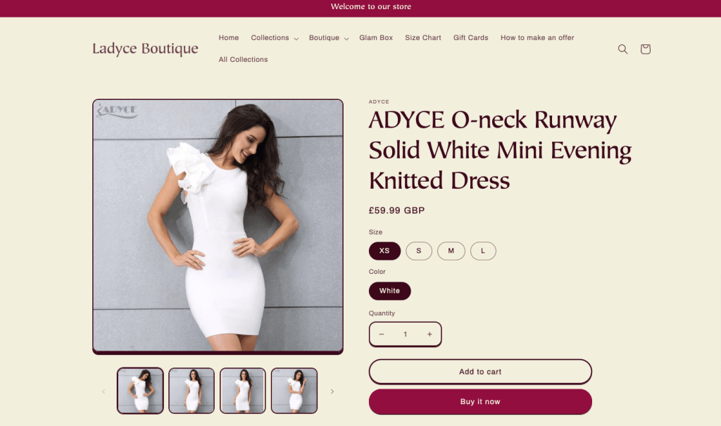
The 2nd title describes many details related to the product such as the
Brand: Adyce
Color: White
Gender: Women
Pattern: solid
Material: Knit
Product: Dress
length: Mini
Neckline: O- neck
Which one would you choose as a shopper?
Hope this example gives you a fair idea of how a title should look.
More information on title optimization can be found in one of our other articles.
Further, ensure that all the product variants are placed right under the product’s title so that your shoppers can get a more comprehensive view of the products.
C. Product Discounts
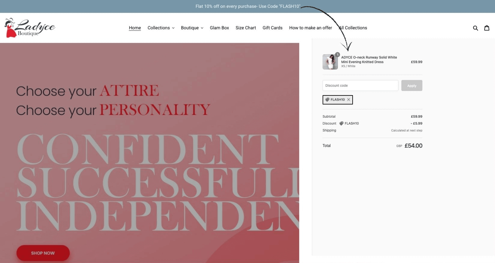
When you advertise your products with a particular discount offer, it should be communicated on the landing page very clearly. As shown in the example below, a visitor should be able to copy and paste the code very easily.
D. Product information and USPs should be highlighted clearly
A product description can be written describing the product’s use case and how it can ease a buyer’s life. The right kind of Product information is what hooks a shopper with your page and further influences him to purchase the product. The pivotal thing is what information you use to highlight your product or what USPs you choose for your product. For different types of products, the way of highlighting product information changes, here are some examples.
I. For apparel category products
- Add relevant product information,
- Product sizes in which that product is available,
- Associated attributes like the product color, design, pattern, material, box contents
- wash and care instructions,
- how to use instructions, if applicable.
II. For products belonging to the Electronics Category
- The product specifications must be described accurately.
- Along with the product’s model number, and color variant, mention the product’s USPs, battery life, warranty period, package contents, dimensions with other technical information.
III. When it comes to the Food and Beverage industry
The information a customer looks out for is the
- ingredients,
- quantity,
- nutritional value
- along with any renowned food facts that may boost the likelihood of sales.
IV. If we check the product-related information in the Automotive Accessories and Restoration Parts industry, the product description needs you to
- specify the model number and brand with which the product is compatible.
- Provide the product dimensions,
- Usage,
- material,
- warranty,
- specific product-related instructions,
- GTINs, and SKUs for customers to be able to verify the correct product.
E. Additional Information
Apart from these apparent ones, you might also provide your visitors with additional information about the brand, and manufacturer details in a nutshell.
It acts as an added advantage if you have an additional widget for the return and refund terms of any particular product just after mentioning the product details.

This assists a visitor in comprehending all of the clauses associated with the product all on the same page. This way, a visitor may save time by skipping through the complete return and refund policy page in the website’s footer, which improves a user’s experience on your landing page.
Placement of call-to-action buttons on the landing page.
When a person arrives at your website, the goal of the landing page is to convert that visitor into a buyer. Hence call to action buttons must be positioned right. It shouldn’t be like a visitor is overwhelmed with the information provided and does not lead further.
Place the call to action buttons of the landing page “Add to cart” and “Buy Now” immediately below the product title and image. All the additional product-related information will be placed after the call to action buttons.
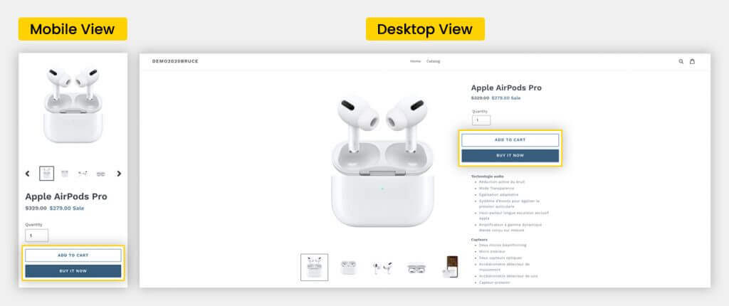
A Buy Now button is an effective tool that allows your customers to purchase from you with a single click by redirecting them to your store’s checkout page. It serves as a convenience for shoppers who just wish to buy one item at that moment.
The “Add to Cart” option works similarly to a supermarket shopping cart, which enables you to pick as many items as you like and pay for them all at once, instead of paying for each item separately over and over again. This saves time and repeated payments.
Note: It would act in your favor if you remove multiple links from the product page. The goal of directing a visitor to a landing page is to convert them into customers, so you don’t want them to leave by clicking on any random link.
Include widgets for similar products
To enhance the seamless experience of a landing page – add widgets like:
Combo offers
You can suggest and offer a discount on the items that are frequently bought together by other shoppers.
Or else the items that are related to the one that a customer is viewing on the landing page.
In the case of electronic items, one can offer extended warranties at a discount.
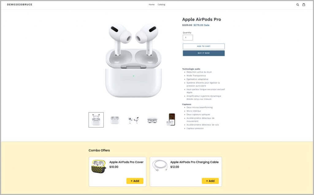
For example with a phone, you can offer accessories related to it at a discounted price.
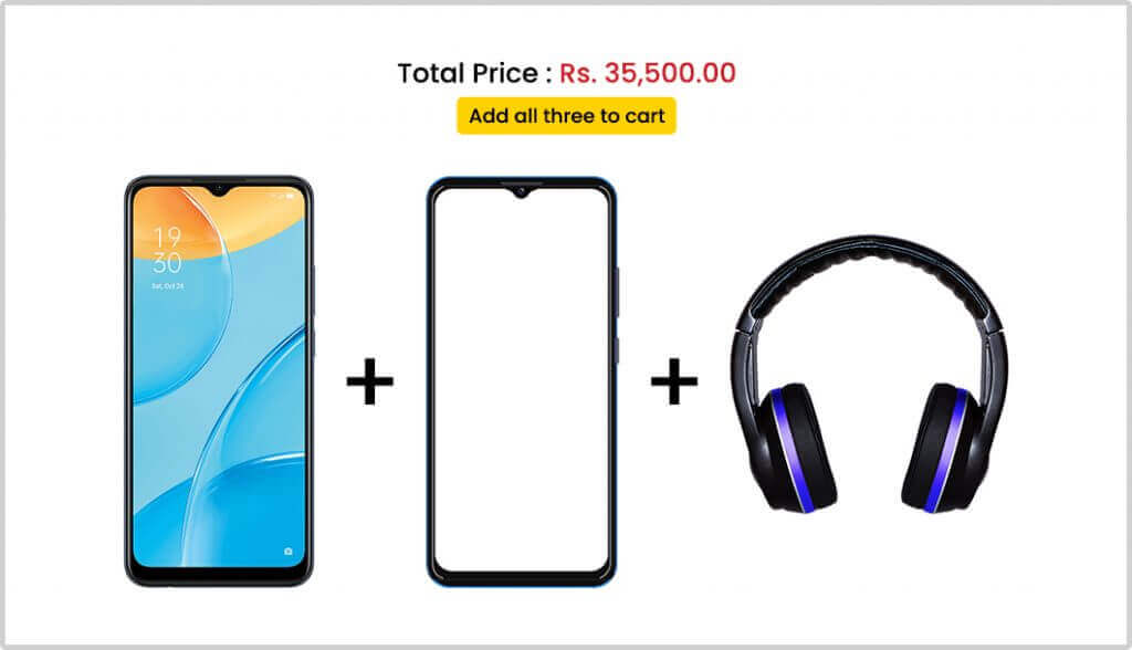
Similar Products:
Under this section, you can showcase some other products you have in some other brand and something similar to what a customer is viewing on the landing page.

Gain visitor’s trust
Gaining visitor’s trust is one of key factors that affects their buying decision.
A. Display customer reviews
One of the easiest ways to gain a visitor’s trust is to display customer reviews on the landing page. Many buyers prefer reading reviews before purchasing a product since it gives them an idea of what other people’s experiences with the same product have been. This enables them to assess whether the money to be spent on the product is worthwhile.
Since reviews serve as the ultimate decision-making point for a visitor on the landing page, they are placed at the bottom of the page.
B. Good page loading speed
When a page takes too long to load, consumers become upset and quit, signaling to Google that your page isn’t the ideal option. Your website’s page loading speed plays a major role in a pleasant user experience.
You can use tools like PageSpeed Insights to give you more helpful insights about your page loading performance.
C. Landing page’s layout
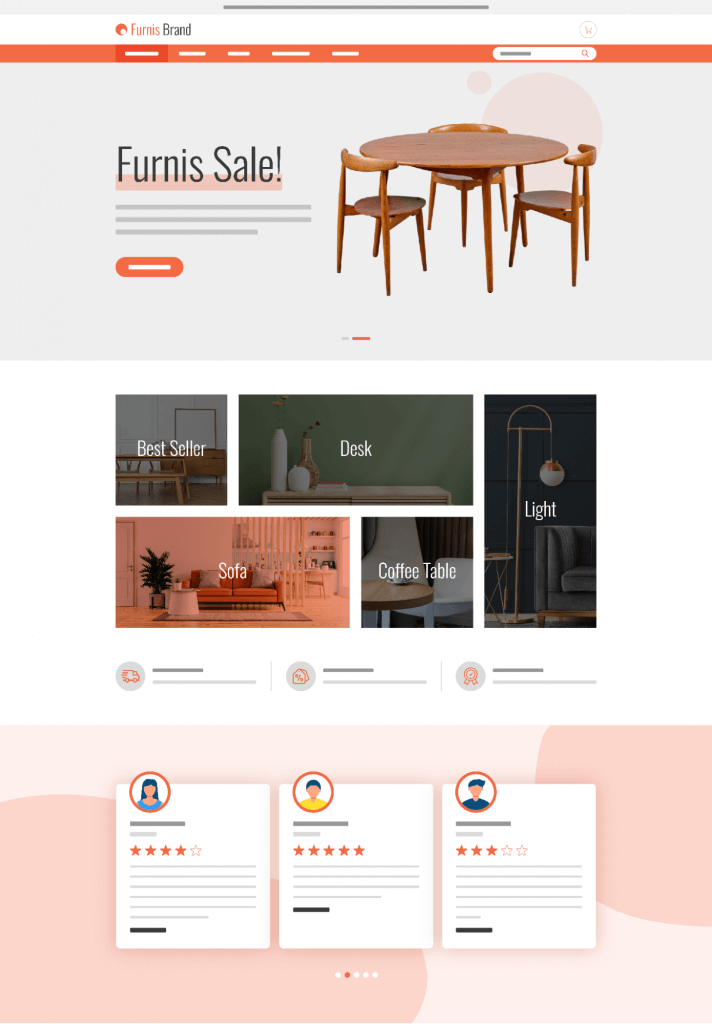
Use a clean and concise design with a basic page layout that conveys your message about a product. A professional design demonstrates that your brand is legitimate and provides a consistent shopping experience.
Providing a consistent experience implies that whether a visitor arrives at your store through mobile, desktop, or tablet, they should have the same brand experience across all of your landing pages. This entails that you must ensure that your landing page automatically adjusts to screen size.
D. Include Q&A and FAQs on the landing page
It is helpful to entice a new customer who is not familiar with your website. FAQs and Q&A help a prospect evaluate the details that aren’t mentioned in the product description.
Reading Q&A helps shoppers gain trust in your brand by letting them know that similar questions have been asked by others. Make sure that the answers to FAQs and questions asked by other customers are written in as few words and in an easy-to-understand language.
E. Turn on the live chat feature in your store
When customers have questions that go beyond the scope of your FAQ page, live chat facilitates customer-business interactions. Customers can breathe a sigh of relief knowing that there is an expert nearby who can answer all of their doubts through a real conversation via chat.
A trained live agent can provide instant query resolution, increasing visitor trust in your store. This increases the likelihood of a visitor returning to the site.
Pro Tip
- A/B Testing
If you are unsure about what to keep and discard from the product landing page, we recommend creating two separate landing pages with different elements that you believe will work for your business. This testing of various landing pages will give you an idea of which elements are more engaging to your visitors. This, in turn, assists you in making the best decision for your store. - Enhance Customer Experience
If you sell products that require “How to Use Instructions,” you can send an email to all of your customers along with the product’s delivery confirmation. This would enhance the customer’s experience with your store, and simultaneously increase the likelihood of the same customer returning for another purchase.
Users want a streamlined experience and providing a landing page that does not adhere to your brand’s standards hints at an unreliable business.
Not only do these attributes indicate a good landing page experience, but conversely, if any of this is missing, it may hamper a shopper’s experience with your brand. It eventually results in a visitor not interacting with your brand again in the future.
Above all, it is rightly said that the first impression is the last. Since your landing page is the first page a visitor encounters, you must give it your all to leave a lasting impression.


Please add an option to subscribe to your blog by email for notification of new posts
Thank you for taking the time to read our blog post. This suggestion is being taken into account by our team and we are already working on the same. For the time being, we recommend that you visit Simprotips to see all of our most recent posts.